Nav tabs
Sign InTabs let the user move around parallel content in a same context.
Usage
- Use tabs when you need to move between views on the same context.
- Split your information into groups that are easy to identify by your end users.
- Order your tabs in a natural way for your users.
- Tabs are meant to be used when you don’t need to compare contents.
- All tabs in a tab bar must follow the same style and type. Changing styles in tabs can produce the feeling of navigation and this is not the desired outcome for this pattern.
- A tab must change to selected state on user selection. It must be easy to identify among other tabs. There can only be one tab selected at same time. The rest of the tabs must be possible to read.
- Tab label must be short, maximum two words, clear and concise.
- Do not use all caps in the label, this complicates the readability of the tab.
- One of the tabs must be always pre selected
Variations
Lexicon counts with two tab bar styles. If there is the case where you have to use both in a page, place first Bordered tabs and second Not bordered tabs.
Bordered tabs
Nav tabs default are used in exterior levels and just below the navigation bar. This kind of tabs give a better context as the border helps the integration with a box below it.

Non-bordered tabs
Non-bordered tabs are used in interior levels such as inside forms and in search results for different repositories.

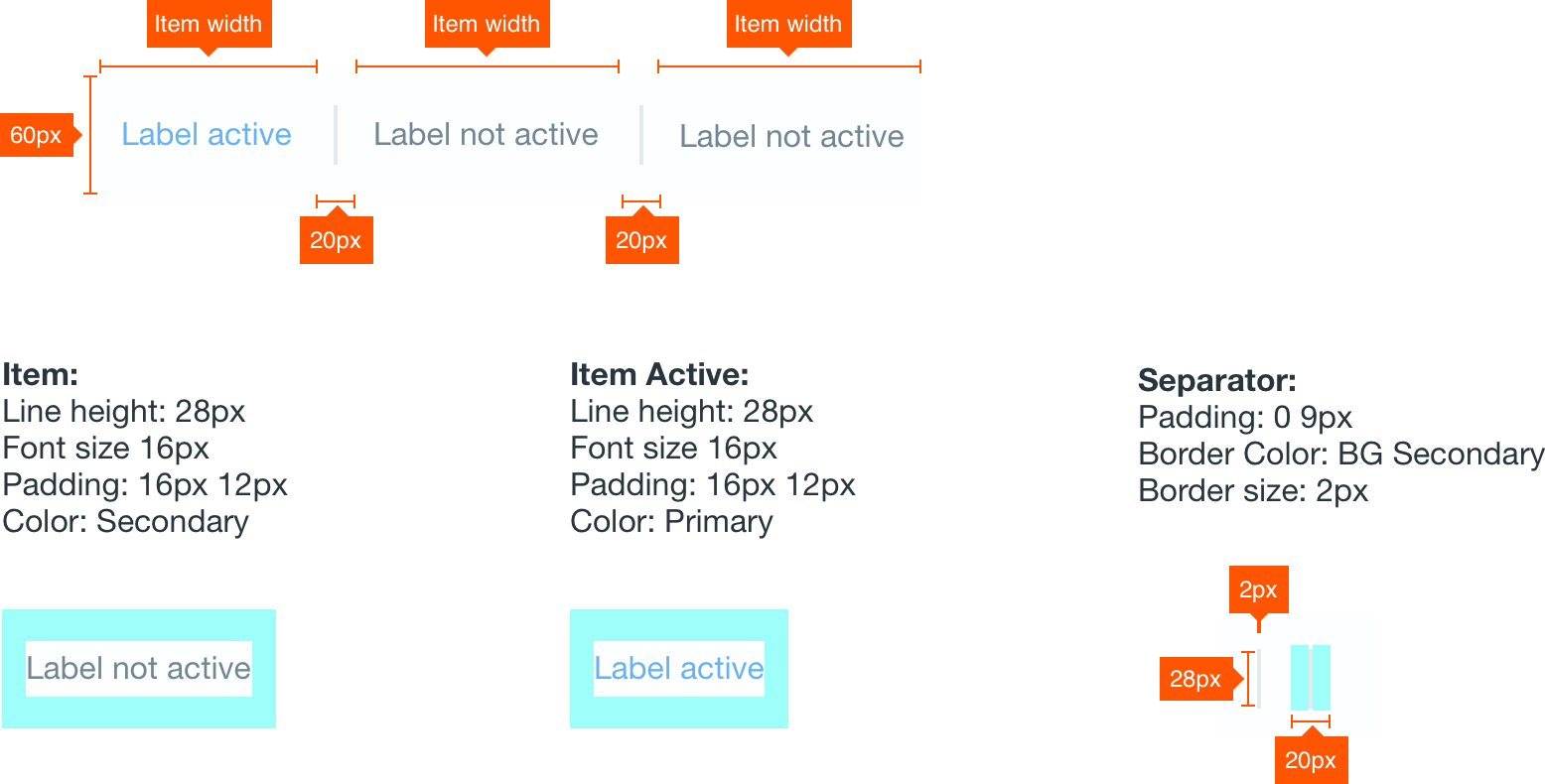
Attributes
Menu